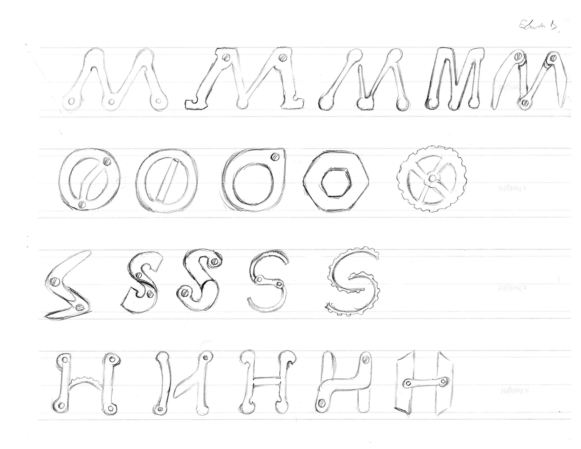
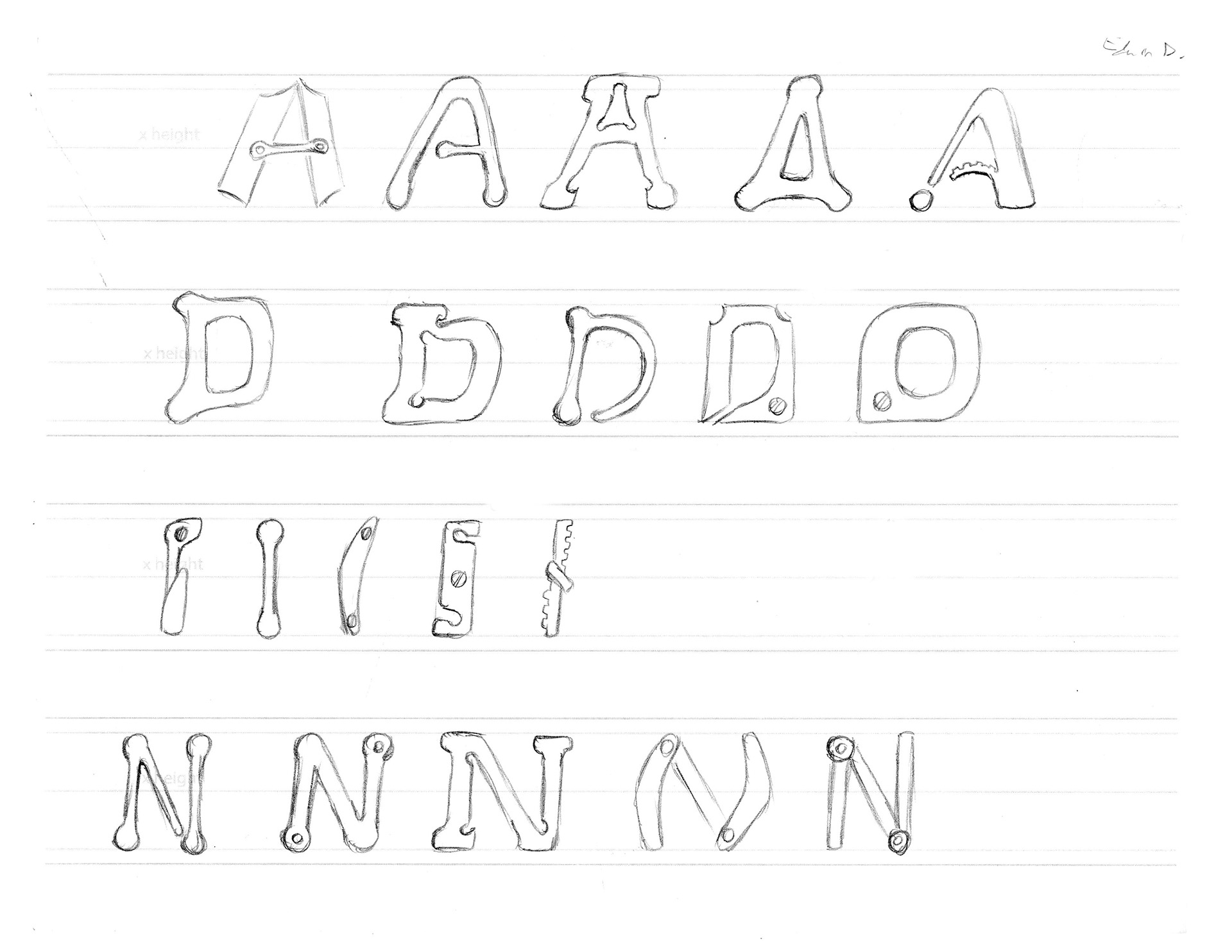
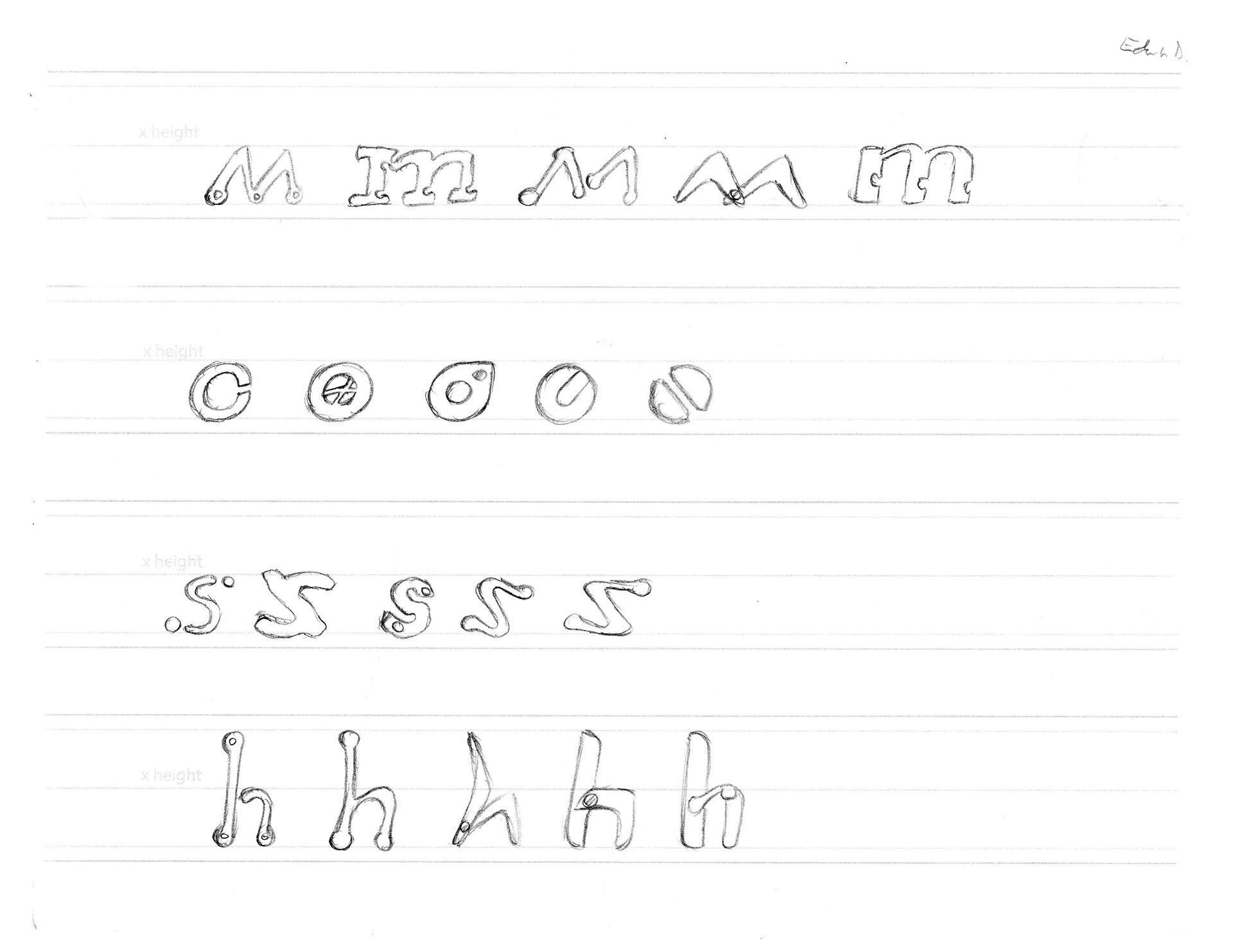
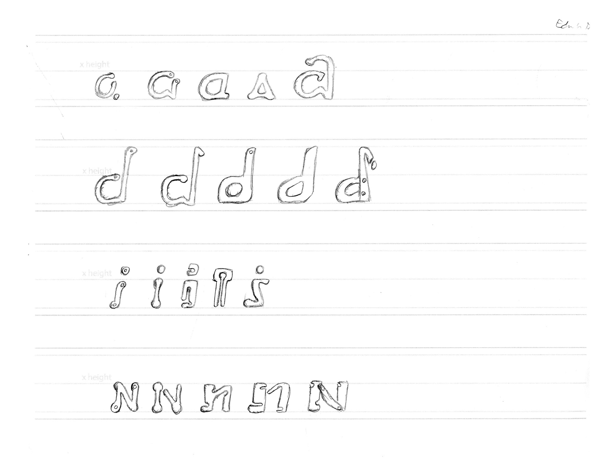
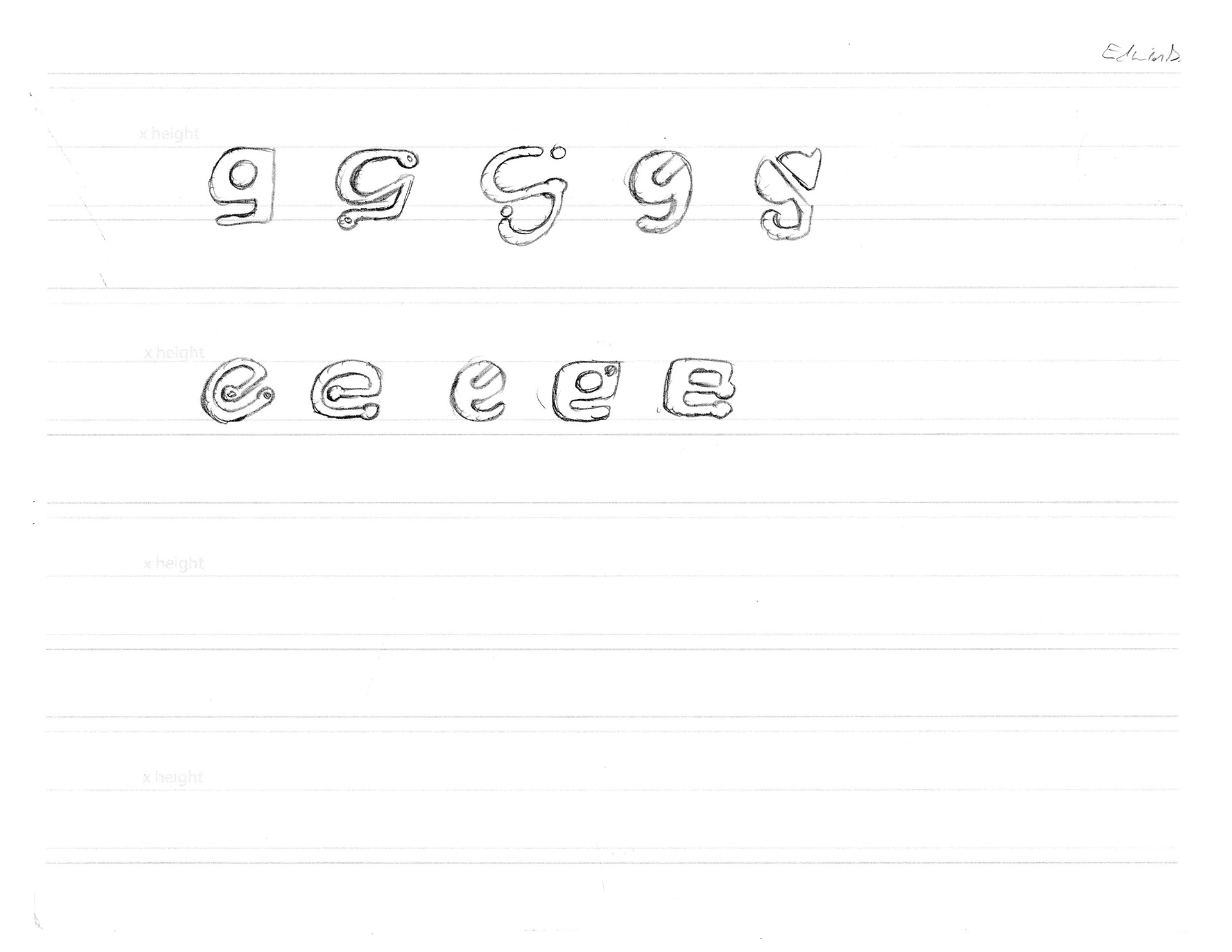
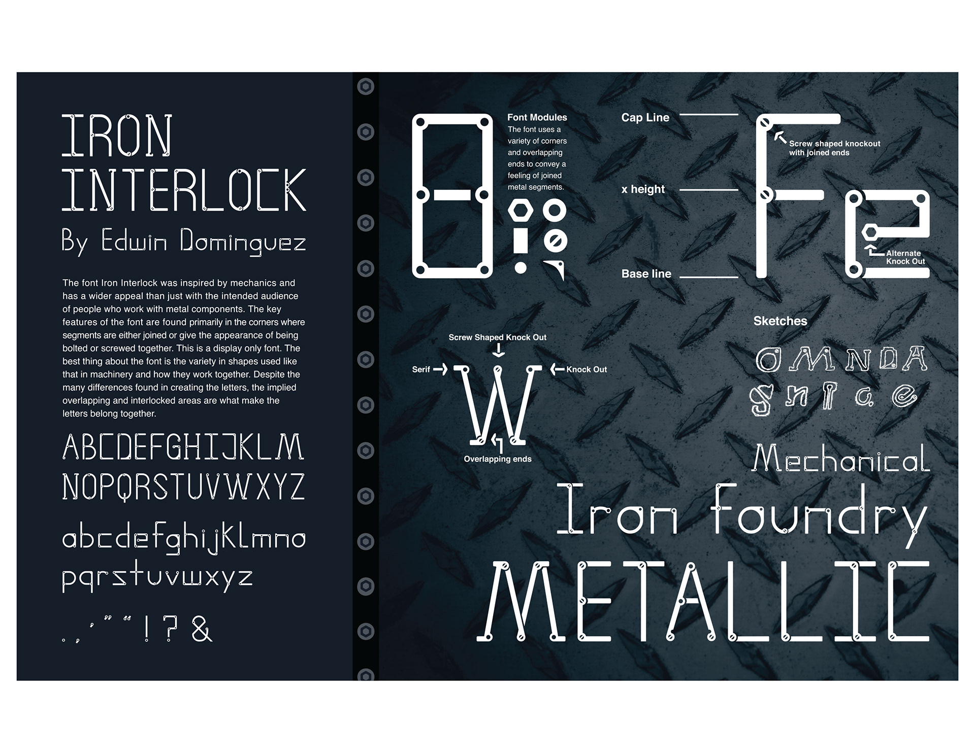
Iron Interlock is a unique font inspired by gears and mechanical components which lead to its intriguing use of knock-outs and overlapping appearance, as though the parts of the letters have depth. Here are some sketches displaying the many routes that were explored in the creation of the font.
The spec sheet for the font is displayed with a white and blue color scheme used, as it is associated with technology, reinforcing the mechanical feel to the font. The use of white and blue also relates to that of blue prints.
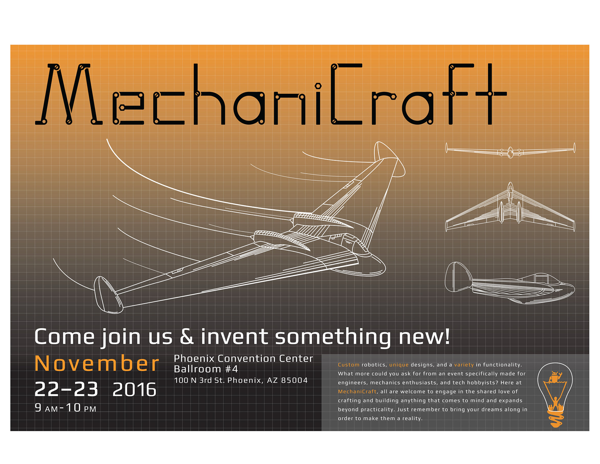
Lastly is a collateral piece putting the font to use as a header for an event that is meant for mechanics enthusiasts and technology loving individuals to participate in the creation and development of whatever comes to mind. It also has a blue print resemblance with the overall structure, but uses orange to excite the viewer rather than calm them down with the color blue.