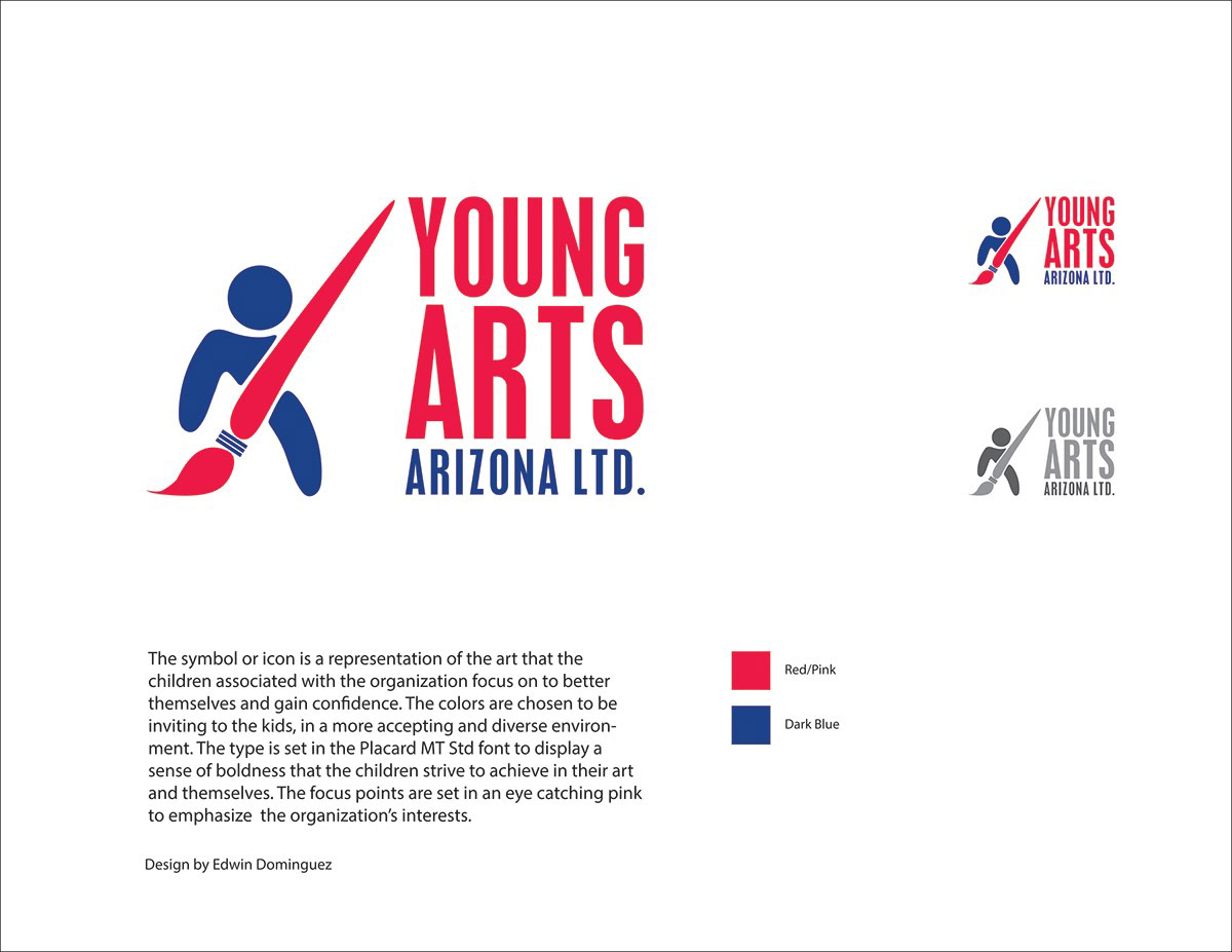
Young Arts Arizona is a non-profit organization that seeks to empower and restore confidence in kids that are at risk, have disabilities or have illnesses through art and self expression. This consists of children up to the age of 18. The logo consists of primary colors as they connect more with children since they are easy to recognize. The icon stands as a representation of the children and their outreach to a better future through art.
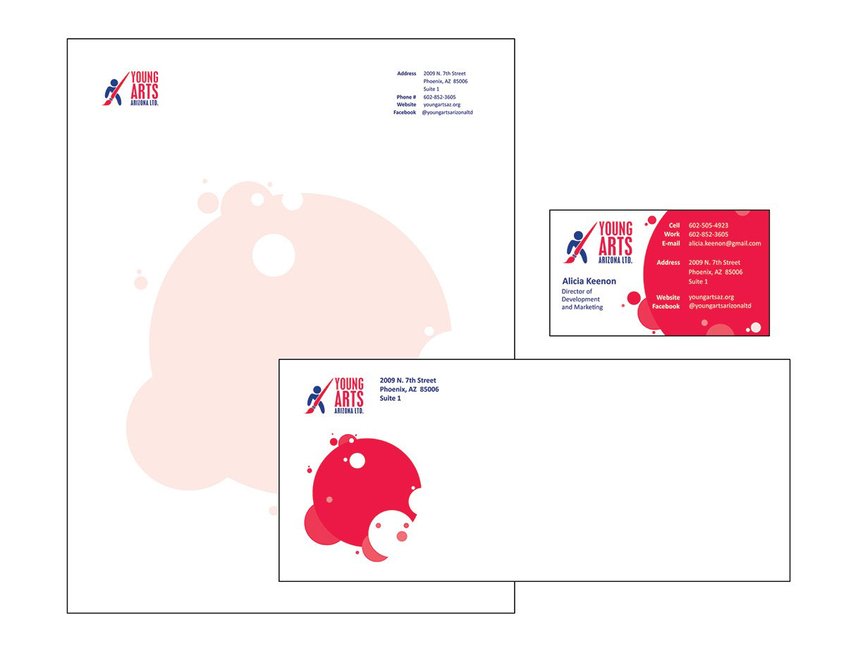
The stationary to be issued throughout the organization, consisting of letterhead, envelope and business card. These utilize a simplistic design and limited to no bleed requirement in order to account for the limited funds the organization, which will decrease printing costs.
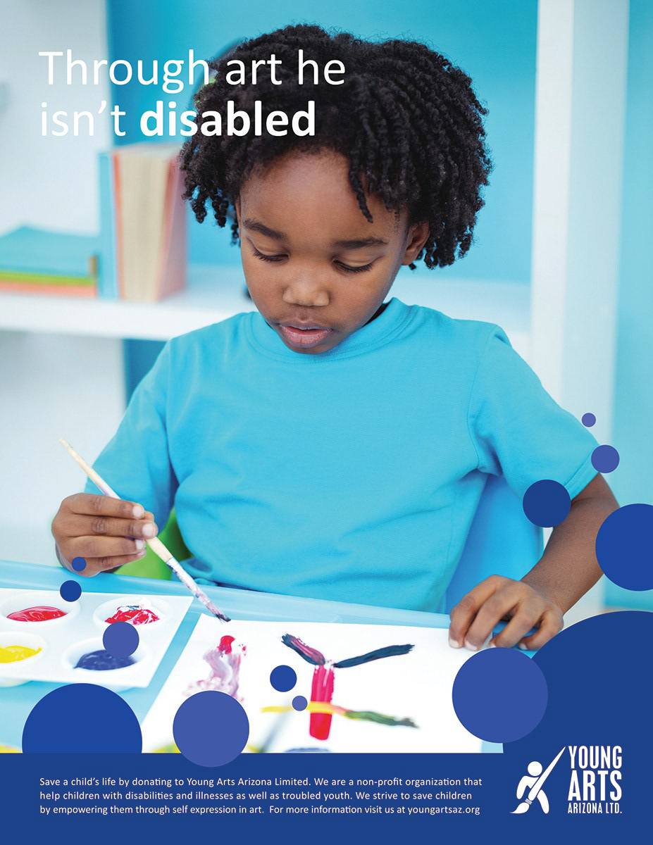
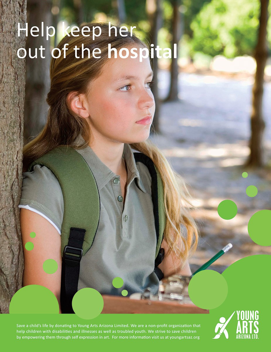
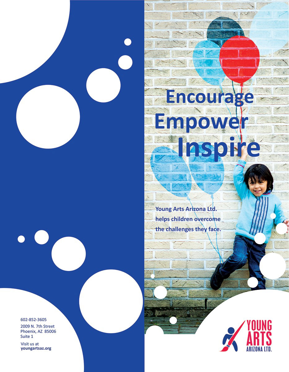
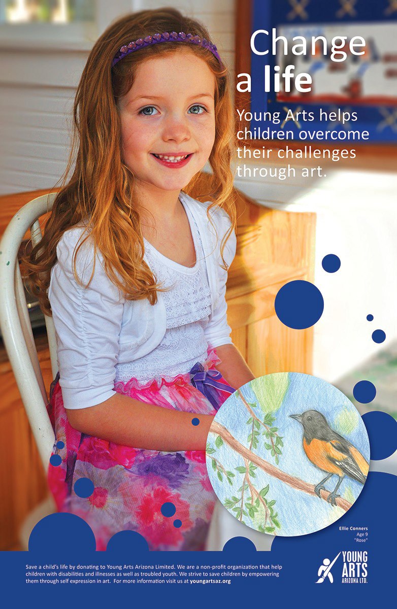
Ad campaign addressing the three main issues: disability, illnesses and at risk youth. Each is using one of the colors within the designated color palette.

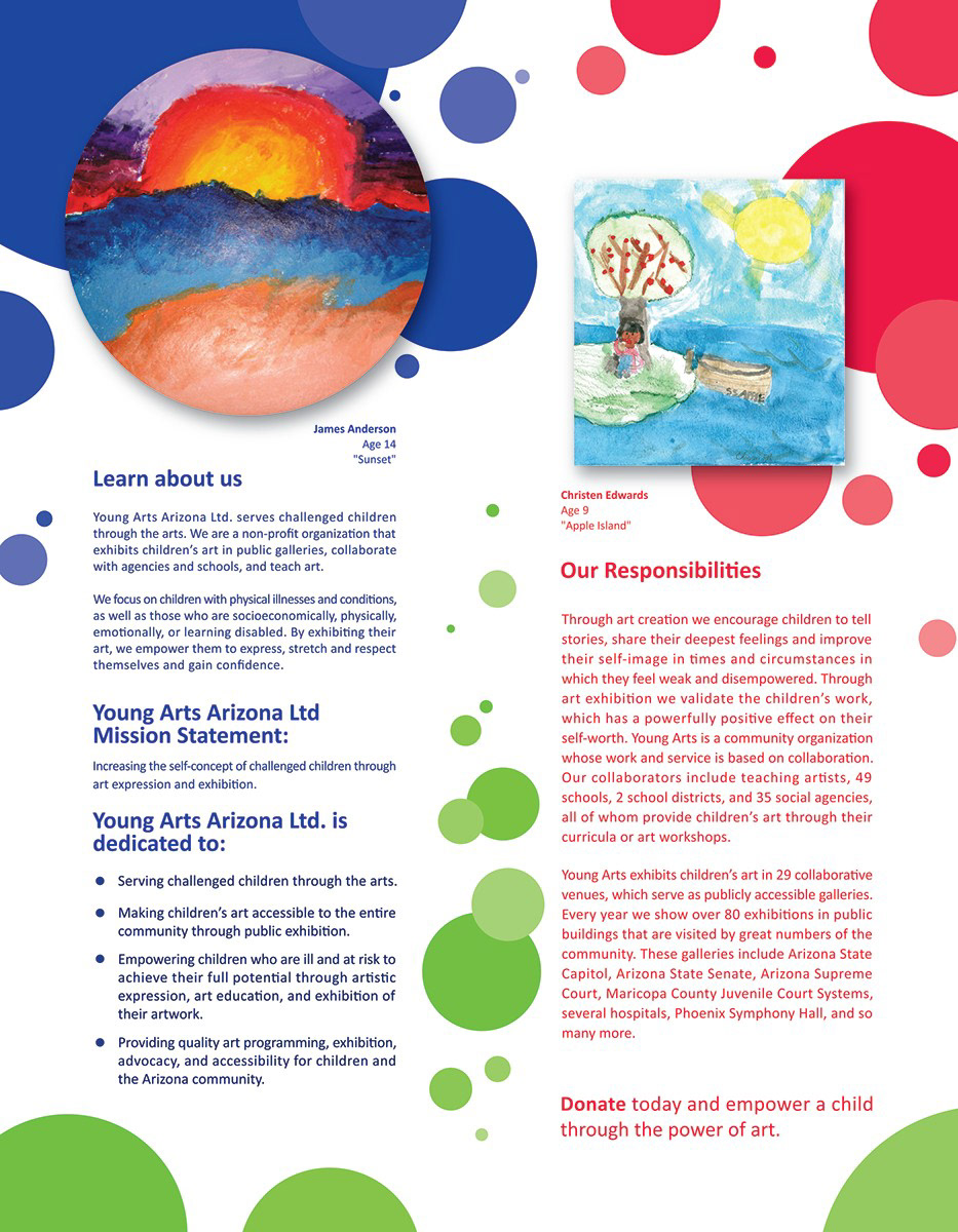
Here are both sides of the brochure. The circular shapes give a nurturing feel while the positioning and color choices make the composition more lively.
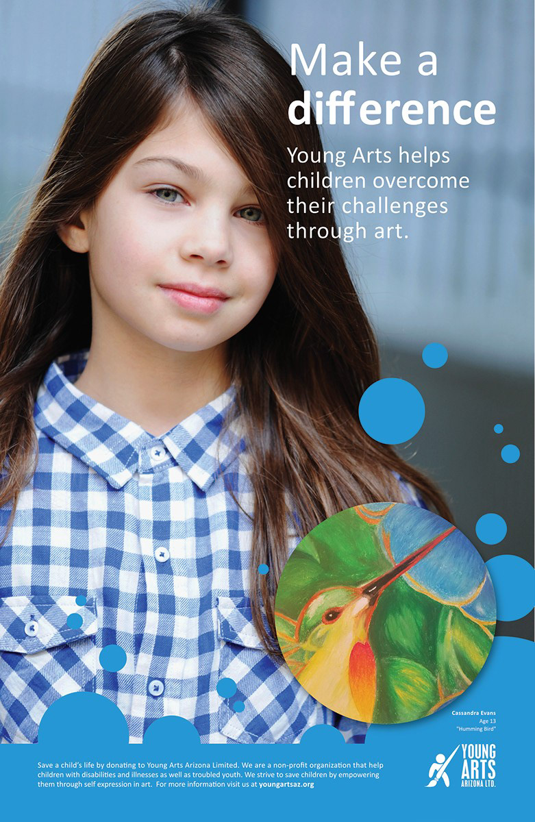
Here are posters that show a child that could benefit from donations. The drawings/artwork displayed are what these children have accomplished through the organization.
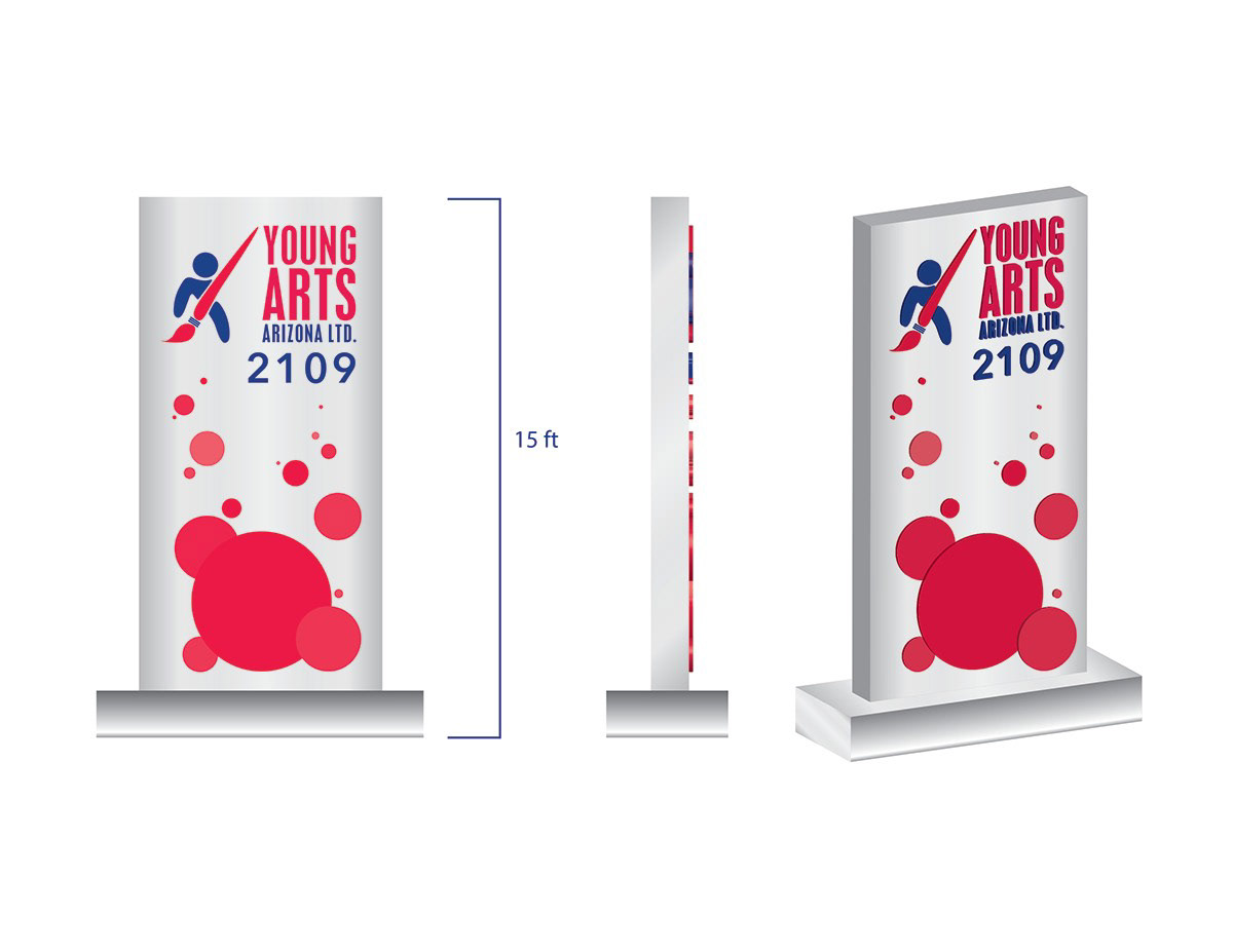
Monument sign standing at 15 feet tall. It is designed with the parents more at mind, but it still gives a lively feel with the circles/bubbles.
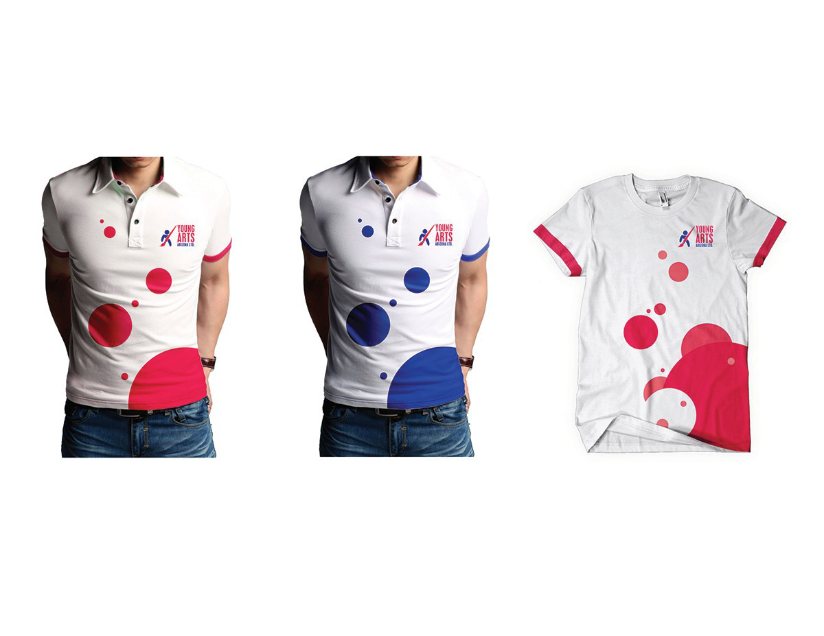
Uniforms on the left, give away on the right. The apparel uses a playful use of the circles/bubbles to be more inviting to children.