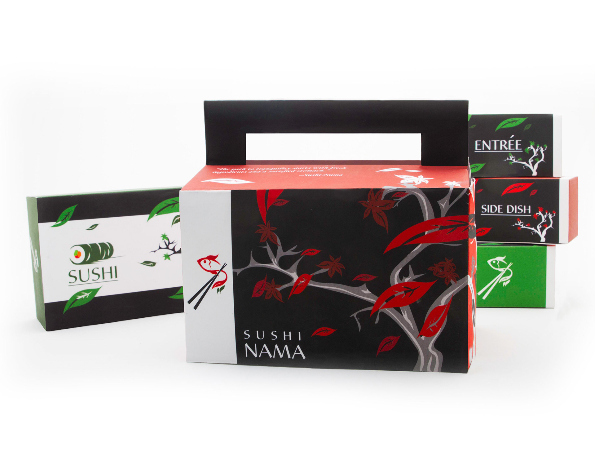
Sushi Nama is a concept for a Japanese restaurant that has an elegant approach and serves those who want to eat healthier with free range fish, organic foods and are overall health conscious. Here is the logo created with simple details and the use of red and green in the color scheme as red is appetizing to the eyes and a touch of green symbolizing the freshness of the food.
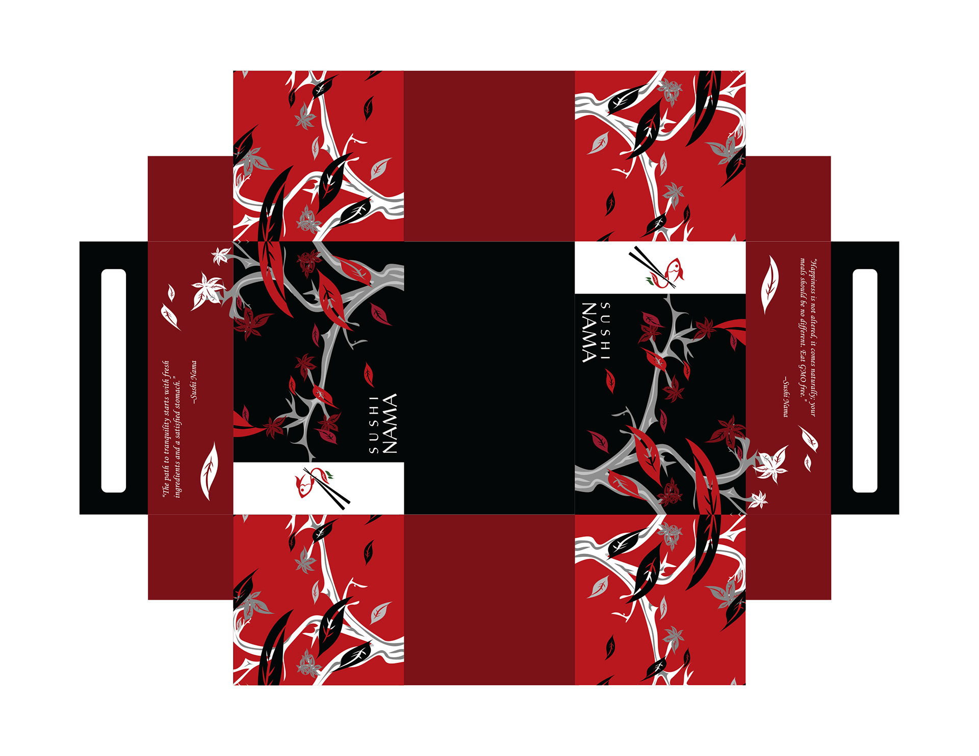
Here is a flattened die-line of the large package used to transport the smaller packages that are to go within it. The design is inspired by Japanese art styles.
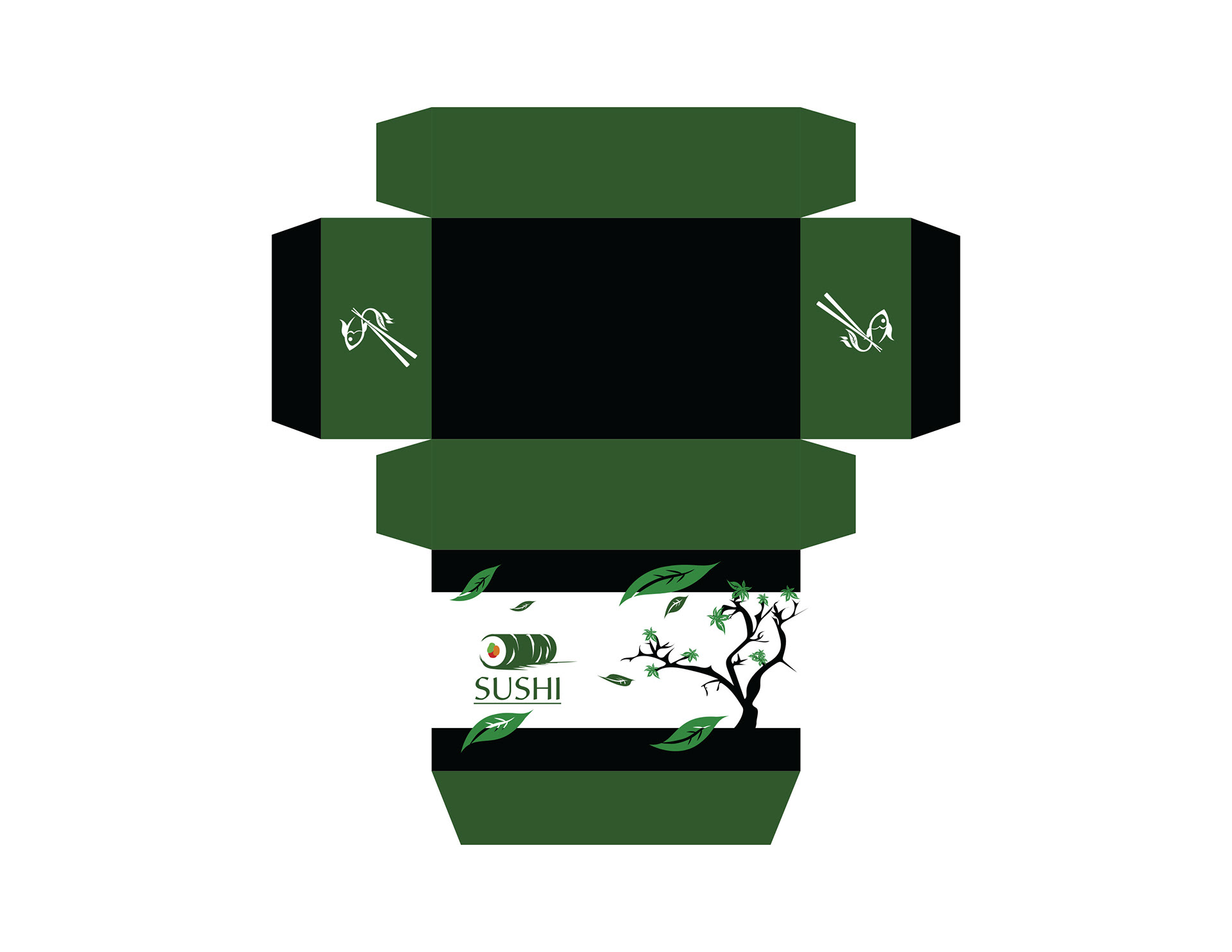
Here is a medium-sized package die-line utilizing the same art style. This package is to be used for holding the sushi rolls within.
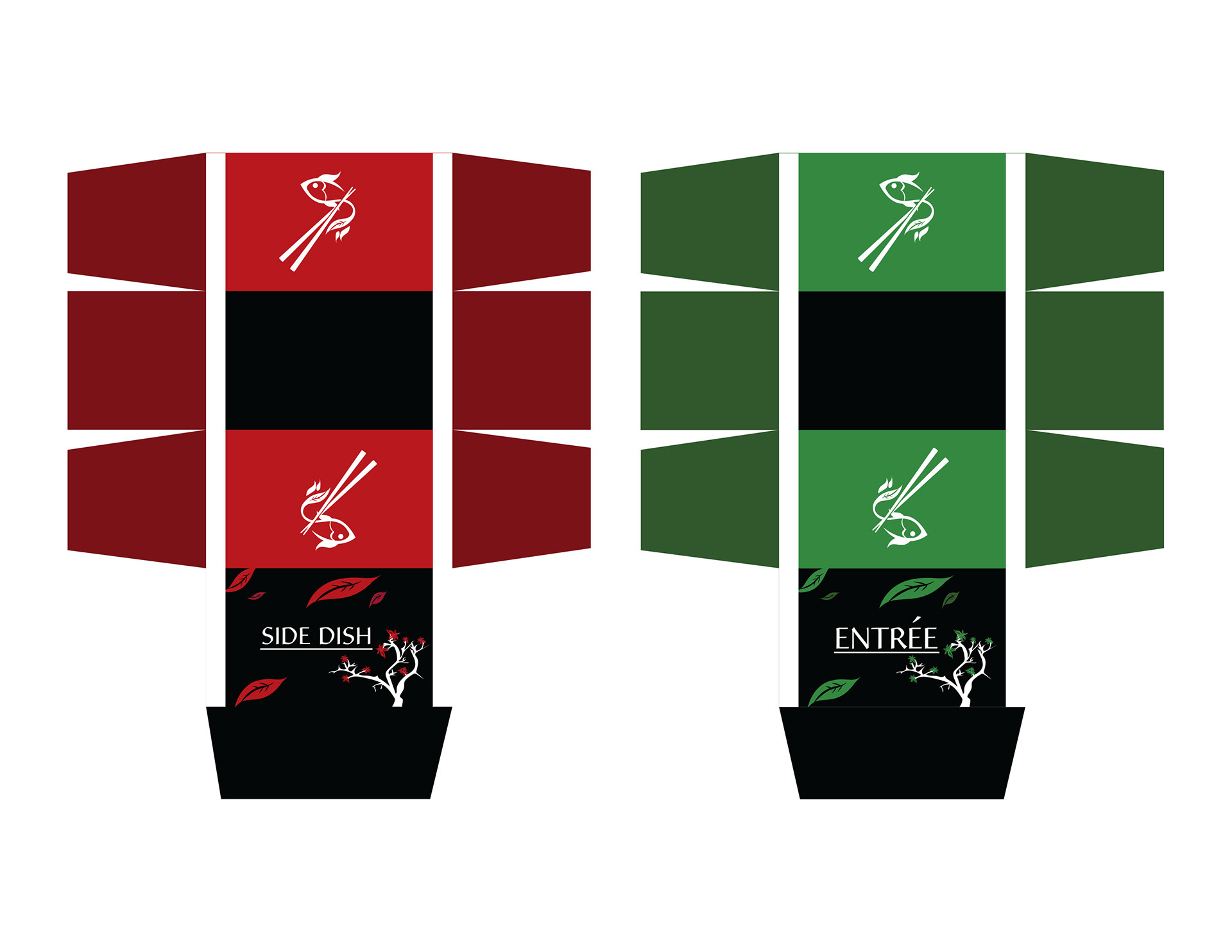
Here are two of the die-lines used for side dishes and entrees. They use the color scheme of red and green to maintain consistency throughout the package designs.
Mock-ups in a close up view are provided to see the detail in the package designs.
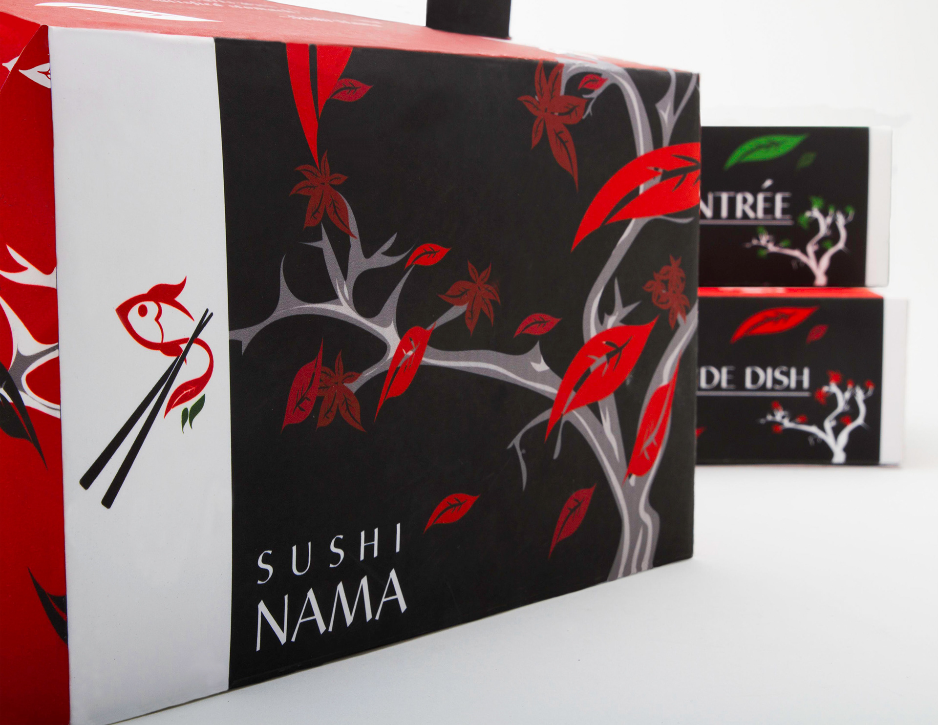
Here are the packages in an overall horizontal display to see them as a set.